I love maps. Maps are a great way to convey information about space, they provide an interactive visual element to websites, and they can reveal insights that traditional text can not. Adding a digital interactive map to a website can be a fantastic way to give something else to your visitors that improves their experience. This is particularly true if what you’re doing is within a certain city or region. A map is a great way to showcase what you’re doing within the physical space (I’m looking at you food bloggers and explorers).
Digital interactive maps also look really impressive. They have the appearance of being something magical made by nerds who spend all their time coding.
But it isn’t as hard as you think.
Let’s make a map!
- Sign up for a Carto account.
- Select create a new map.
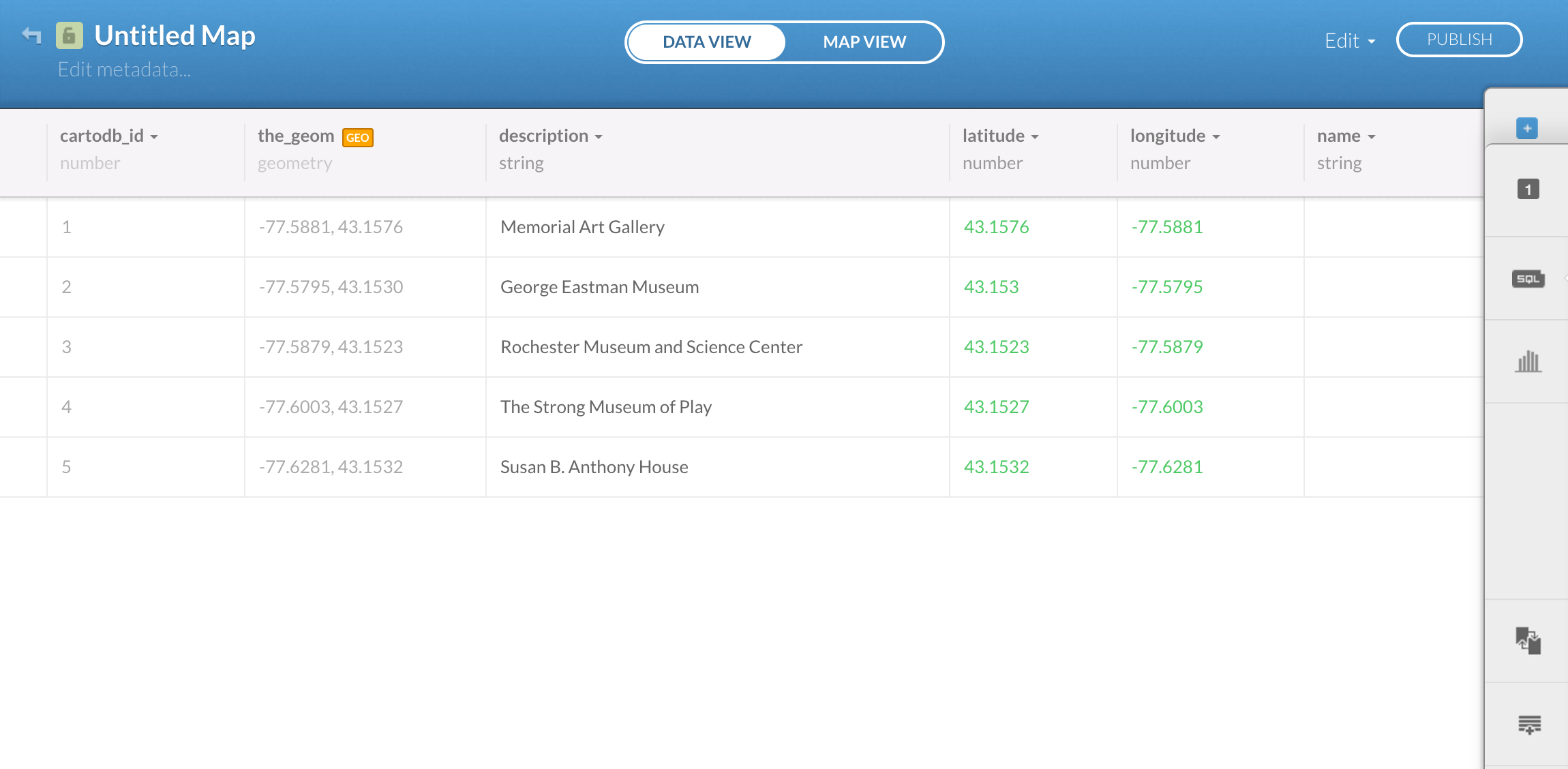
- Add dataset: this is the stage where you add your data, usually in spreadsheet format. You can either upload your own data or you can steal my dataset here. Click ‘Connect Dataset’ and either upload or input the URL of the data (here is my data’s URL: https://raw.githubusercontent.com/bonesdontlie/playingwithcode/master/MuseumMapDataset.csv). Note: this may take a little time to load.

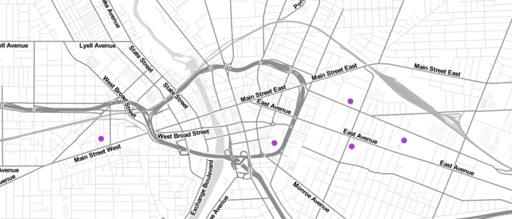
You should see a map now with five locations (you may need to zoom out to see this). Cool, right? If you click on ‘Data View’ at the top, you’ll see that there are five museums that are in the data, and that the only information we have is their name. If you want, this data page is where you could add another data point, edit the data, or add more information.
Switching back to ‘Map View’, we can begin to customize this map a little more since it isn’t quite usable in its current state.
- Click on ‘Info Window’ on the side bar. This will let us customize what users see when they click on the little dot in the map that corresponds to one of our locations.

- Toggle the ‘Description’ button and make sure that ‘Title’ is checked yes.
- Now, if you click on the dots, they show you the museum’s name.
- Click on ‘Wizards’ on the side bar. This will allow us to change the color, size, shape and look of the data points.
- Marker Fill let’s you change the orange color and the size of the dot
- Marker Stroke changes the outline around the dot
- Label Text will allow you to add a name to the dot if you want to

- So change this to some color you like using the available colors or inserting your own hexcode… I’m going with #9932CC, known as Dark Orchid.
- I’m also going to increase the size of the marker fill and stroke a little
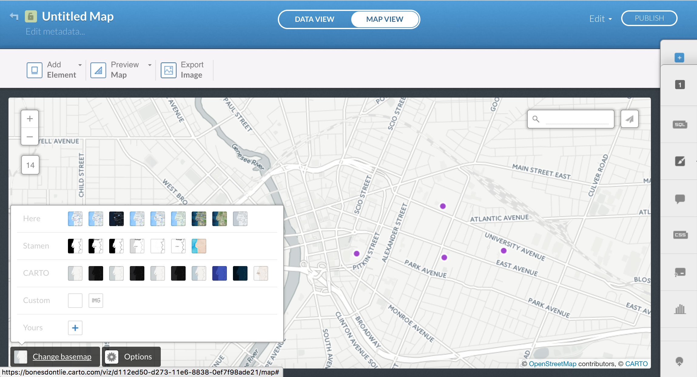
Finally, let’s change the basemap. If you look in the bottom left corner, there is an option to change basemap. This allows you to really change the look and feel of the map. I’m picking Toner Lite because it has a fun minimalist look to it.
Ready to put it into your website? Select ‘Publish’, and then copy the code in the center option that says ‘Embed’.
Now head over to your website, and copy the code into the HTML or Text area of your site.
If you’re working on WordPress, when you get to the ‘Publish’pop-up, select ‘Go To Your Map’, and then copy and paste the URL of the resulting map into your text window.
And bingo- you’ve got an embedded map.
https://bonesdontlie.carto.com/viz/d112ed50-d273-11e6-8838-0ef7f98ade21/embed_map
Questions? Feel free to tweet me or comment below!
Want to customize more? Let me know!

Leave a comment